.png)

As marketing students, we’re learning the key strategies behind successful brands. But how do we apply those same principles to create a brand for ourselves? Whether we’re gearing up for internships, networking events, or launching our careers, developing a strong personal brand is essential to standing out in a crowded field.
In this post, I’ll talk about how I developed my personal brand elements using the strategies we study in class, from my brand color palette to my five-sense brand association, and how you can do it too!
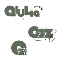
When it comes to getting started on building or even ideating your logo, it can definitely be a hard task. For me, it was about more than just a symbol; it needed to capture the essence of my brand’s tone, mission, and personality. I wasn’t just designing a logo, I was laying down the first visual impression of my personal brand
I knew early on that I wanted something clean, but also fun and eye-catching, a look that feels professional without losing personality. That balance was important to me. I wanted the logo to feel elevated, but still accessible. Sophisticated, but with a spark.
One of the biggest decisions I made in this process was around the name itself. I have three last names, and instead of choosing just one, I decided to incorporate all of them. Each name carries meaning and history, and together, they represent who I am, both personally and professionally. Over the main logo, there’s a cursive “L” layered on top. It represents the last of my three last names. I didn’t want to leave any part of my name or identity out of the branding, so including the “L” was my way of making sure the full picture was there. It adds a small personal touch without overcomplicating the design. In a world that often encourages simplifying or trimming down identities, I chose to embrace the fullness of mine. That choice became the heartbeat of my brand.
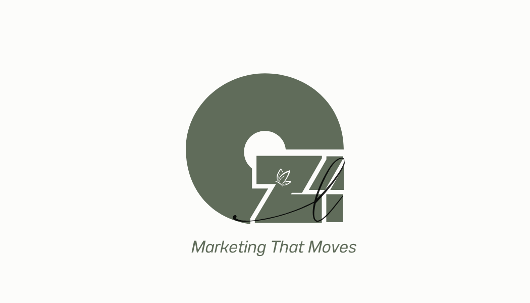
When I was coming up with a tagline, I knew it had to hit a few things. I want to work in sports marketing, so I wanted something that felt fast, energetic, and active, just like the industry. But it also needed to say something about me and how I move through the marketing world.
That’s how I landed on “Marketing That Moves.”
It felt right because it works on a couple of levels. Yeah, it fits the vibe of sports, movement, momentum, action, but it also speaks to how I work. Marketing is constantly changing, and I’m always trying to stay in motion with it. Whether it’s trends, tools, or strategy, I like being ahead of the game, not catching up.
It also just sums up the kind of work I want to do. I don’t want to make stuff that just looks good, I want it to do something. Make people stop scrolling. Feel something. Take action. That’s what “moves” means to me.
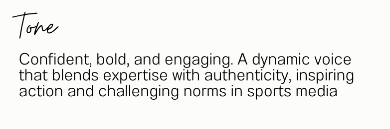
When it came to finding a tone, I knew I wanted to stay true to myself, I wanted something that reflected who I am, how I speak, and what I stand for.
I landed on a voice that’s confident, bold, and engaging. It’s dynamic, something that blends real expertise with authenticity. I want people to know I know what I’m doing, but also feel like they can connect with me. Because at the end of the day, that’s what good communication does. It builds trust, it inspires action, and it makes people feel something.
I also knew I couldn’t ignore the space I’m stepping into. As a woman in sports, this voice matters even more. I want to challenge the norms, push the boundaries, and bring something different to the table. This industry moves fast, but I’m not just trying to keep up—I’m here to shift the energy and take up space.
This tone shows up in everything, from the way I write copy to how I show up on social to how I pitch myself. It’s not just about sounding good, it’s about being real, being intentional, and making sure every word reflects what I stand for.
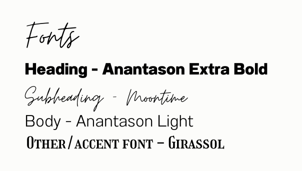
Picking the right fonts was actually a fun part of the process. I didn’t want anything too stiff or too “trendy”, just something that felt like a good match for the vibe I was going for: clean, bold, and a little bit playful.
For headlines, I went with Anantason Extra Bold. It has a strong look without feeling heavy, which worked well since I wanted the brand to feel confident but not overwhelming.
Then there’s Moontime, which I use for subheadings. It’s a script font, so it adds a more personal touch. It’s got a handwritten feel, which helps break up the structure and keep things a bit more relaxed.
For body text, I use Anantason Light, same family as the headline, just lighter and easier to read. And Girassol is my accent font. It’s got some personality without doing too much.
Overall, I just wanted the fonts to feel easy and intentional, like they fit into the brand without trying too hard. And I think they do exactly that.
Color was a big part of shaping the vibe of my brand. I didn’t just want it to look good, I wanted it to feel right. The colors needed to reflect both who I am and the kind of energy I want to bring into the space.
I went with a mix of neutral, earthy tones and bold, warm accents. The muted greens and greys give everything a grounded, clean look, like a solid foundation. Then there’s that rich gold and deep brown that add a bit of warmth and personality. They stand out, but not in a way that’s too loud. Just enough to catch your eye and keep things interesting.
Here’s a quick breakdown:
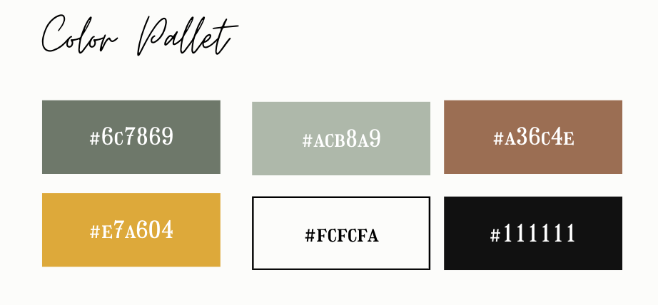
Together, the colors feel like me: natural, thoughtful, and a little unexpected. They give the brand versatility, something that can flex depending on the vibe but always stays cohesive.
This part was definitely one of the hardest to figure out. I didn’t want to overthink it—I just went with what felt right for me, both as a person and as a professional. I asked myself: How do I want people to feel when they hear my brand name? When they see it, experience it, and interact with it?
It wasn’t about being super literal, it was about building a vibe.
Here’s what that ended up looking like:
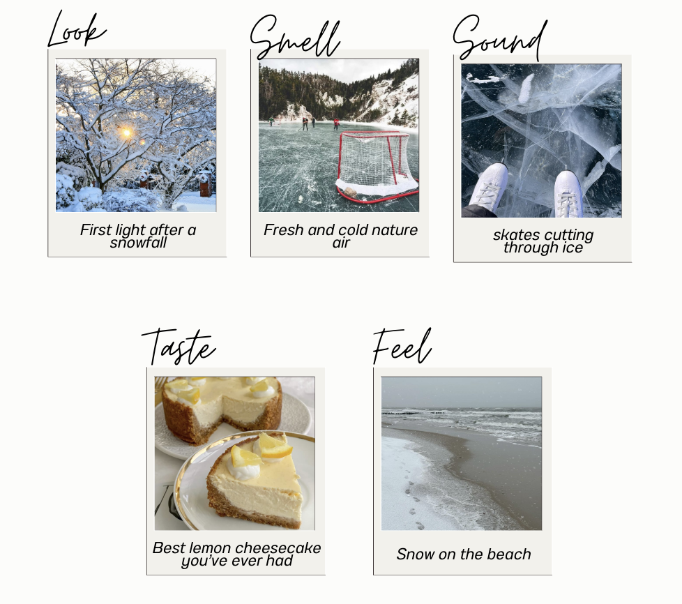
At the end of the day, this wasn’t about being “perfect.” It was about making sure my brand feels like me, and gives people something they can actually connect with.
Building your personal brand elements doesn’t have to be intimidating, it’s really just about getting intentional with how you show up. By applying the same marketing strategies we study in class to myself, I created a brand that not only reflects who I am but also supports where I’m headed. From the fonts and colors to the tagline and tone, every choice was a chance to express my identity, my values, and my goals in a way that feels authentic and future-focused. If there’s one thing I’ve learned through this process, it’s that your brand isn’t something you have to go searching for, t’s already within you. You just have to shape it, trust it, and let it speak for itself. So whether you're just starting out or refining what you’ve already built, remember: your brand is your story, and no one can tell it better than you.
.png)